The 1970s Playbook
Today’s inflation mirrors the Great Inflation of the 1970s
The Great Inflation of the 1970s is a stark warning: if inflation doesn't drop as expected, central banks may be forced into drastic action. This could disrupt economies and further derail plans for a soft landing.
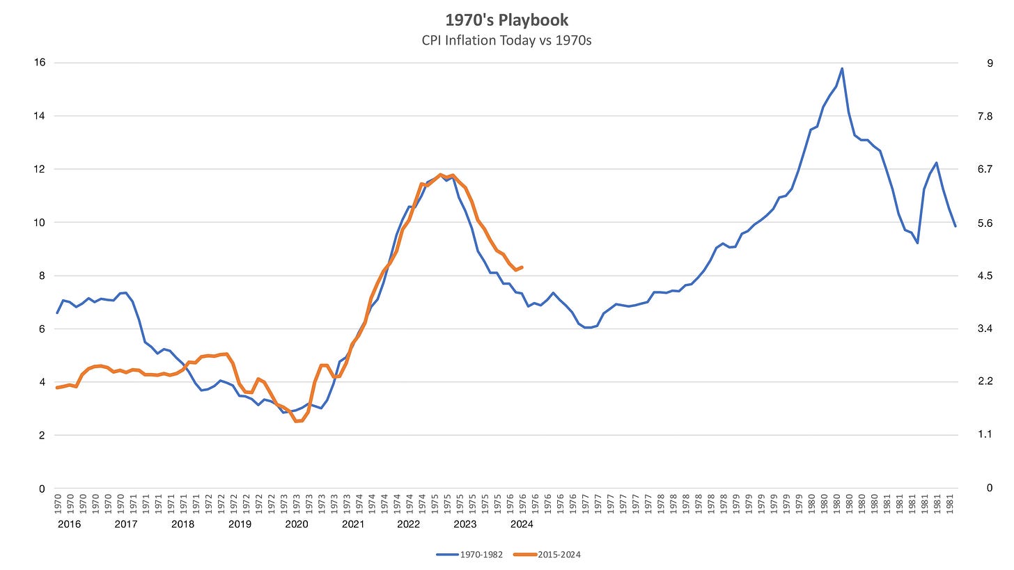
I put a chart together (down below) showing similarities between 1970s inflation and today. The similarities are stark and portend difficult economic times ahead if they play out.
The 1970s offer a troubling lesson for today's inflation fight. Supply shocks, first from the pandemic and now the Ukraine war (alongside further disruptions from Middle East conflicts), mirror the energy crises of that era. Loose monetary policies then and now have worsened the situation. Central banks have aggressively raised interest rates to the highest since 2007 to curb inflation, but they may overshoot, risking an economic crash like the early 1980s.
The Fed isn't budging on interest rates. They signaled this week that they won't lower them prematurely, vowing to keep them high until they're absolutely certain inflation is under control.
The minutes said:
“Most participants noted the risks of moving too quickly to ease the stance of policy and emphasized the importance of carefully assessing incoming data in judging whether inflation is moving down sustainably to 2 percent.”
“In discussing the policy outlook, participants judged that the policy rate was likely at its peak for this tightening cycle.”
“Participants generally noted that they did not expect it would be appropriate to reduce the target range for the federal funds rate until they had gained greater confidence that inflation was moving sustainably toward 2 percent.”
The “Overshoot” scenario seems to be playing out right now, holding rates higher for longer risks pushing the economy into an early 1980s-style economic crash.
Let’s look at this chart. Similar charts have gone around the interwebs so there’s nothing new here. Except, I put this chart together myself so that it can be kept up to date for readers of The Pipeline. Each time it’s updated with the latest inflation data, which is roughly every month, the update will be included in our Weekly Recap newsletter.
The blue line is 1970s CPI inflation taken from the Fed’s data – Sticky Price Consumer Price Index less Food and Energy.
The red line is today’s inflation starting at the end of 2015 overlaying the 1970s data. The data has not been compressed horizontally or vertically to make these fit. The blue line is indexed to the axis on the left while the red line is indexed to the axis on the right. That’s all there is to it.
This near-dovetail fit was not massaged out of the data. What we’re experiencing now is stunningly similar to the Great Inflation era of the 1970s.
We're only seeing the beginning of a turbulent ride. The Fed's actions will lower inflation temporarily but expect a brutal surge back in 2-3 years. This could culminate in an early 80s-style crash within 5-6 years.
If, of course, the 1970s playbook plays out. We’re not saying it will. We are saying to keep an eye on this chart.
Our primary focus around here is gold and silver investing and stacking. Knowing what’s coming down the pipe helps us decide if it’s time to increase or slow down asset purchases.
The 1970s playbook may play out or it may not. It’s up to the reader to decide. If it does play out it signals hard times ahead with rising inflation and an 80s-style recession job market.


